Showing posts with label renovation. Show all posts

Thursday, May 22, 2014

When Life Gives you Lemons

Illustration by moi.

I'm due to deliver Baby Quinn anytime between now and June 16th, but that doesn't mean my other baby, Project Maltman, the duplex project I began a while back, is on the back-burner. NOPE. My team of contractors are chugging along... full-force ahead. It's important to acknowledge that I'm used to getting in and out of projects rather quickly (think 3 months max), but this particular renovation has kept me busy for nearly 9 months to date! What came to me as a cosmetic fixer turned out to be a total rebuild. We're talking major water damage, termite damage, asbestos findings, foundation issues... But as the saying goes, "When life give you lemons..." KEEP THEM. BECAUSE HEY, FREE LEMONS.

Well, good things come to those who wait, and the guts of this place will soon be flawless. With that said, I am now focusing on beautifying the joint, but as you can imagine, the cost of reframing, rewiring, replumbing, not to mention the cost of new flooring, new HVAC, new water heaters, and new decks have left me with little wiggle room for the good stuff. Finishes. But constraints can be a blessing. (I'm trying to think positively here!) There's no shame in installing simple subway tile. When combined with black and nickel or chrome hardware, classic subway tile can be totally refreshing.

"I have said that black has it all. White too. Their beauty is absolute. It is the perfect harmony." 
- Coco Chanel

"Bright and airy. Lots of white with touches of charcoal for contrast. Open, modern, relaxed with an industrial and vintage twist." That's what I scribbled in my notebook while brainstorming "the look" at my neighborhood Starbucks. Heaven knows how this project will turn out. It's been incubating longer than my second child...

A peek at what's been cooking in the kitchens. Both upper and lower units. 

Let's start with the upper: 

Pictured to the right of the kitchen is the entryway. More on that space later.

The kitchen's orignal layout was an L with an island. Remember THIS POST? Well, I have since reframed the entry way to the kitchen and have also centered the only window in the space. The kitchen's new formation will be a galley, but the square footage remains the same. 8.5 wide' and 14.5' long. SKINNY! Layout drawings of the two sides of the space here:

It took a while to convince my millworks guy that an offset range looks rad. I showed him inspiration pics like these:


Fresh, yeah?! Now one nice thing about this configuration is that the project can save on tiling. Because we're only tiling up to the floating walnut shelf, I suggested we go with a dramatic glossy black Heath tile for a crisp look like this:

 
IKEA

When used in moderation, black subway tile can look incredibly fab. Just enough drama. And hey, if it's good enough for Olivia Pope (I'm a die-hard Scandal fan, and her kitchen backsplash is black), I say it's good enough for everybody.

Back to the entryway. How happy would you be if you were greeted with this Tom Dixon pendant on your way in? 
Instead of this:


You'd be greeted with this:


He comes in several finishes, but at the moment, I'm totally in love with the copper. Decisions, decisions.

Moving on... The lower unit is currently looking like this. 

Demolished and reframed.

This is wall unto which much of the lower unit kitchen will be installed:


The kitchen will be open to the living room and will feature a small island that can seat two. The layout has yet to be finalized, but it will likely look something like this (the island will sit in front of the wall, not next to it):


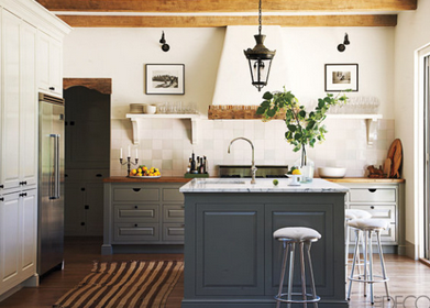
Because the lower unit does not capture as much natural light as the upper unit (upper unit balconies block a good deal of the sun shining down below), the cabinets will be some shade of white. The island, however, may either get painted a shade of off-black and topped off with a slab of carrara or encased in wood for warmth. Goodness, I can't decide. Some inspiration images:


To save on tiling expense, the strip of backsplash behind the range will likely be stainless steel. I've never installed stainless steel as a backsplash before, so this will be a first. Hoping it looks good. But if I opt to top the island off in butcher block, how beautiful would a slab of natural stone be?

And how cool would it be to have this Brass T fixture hanging above the little island?


I haven't ordered the fixture yet out of fear that I may change my mind and want to go for two small milk pendants... Thoughts?
This project is scheduled for completion mid-July. Hopefully I'll find time to post more updates. But between Quinn and Maltman (name of the duplex), and Olive, I'm juggling more than enough babies!

Wednesday, February 05, 2014

I Swallowed a Beach Ball

As is typical of my FREQUENT blog posts* I shall open with an apology. An apology for being so darn absent. For those of you raising little human beings, you understand. We have to keep the munchkins alive and healthy (the baseline for motherhood), and it's not as easy as it looks. Look at what I'm dealing with:


Ahh... The beauty of potty training. In the kitchen. 

Anyhow, Olive aside (she's a time-suckage, so a photo was warranted), I have been juggling my day job. Refuge Design Build completed two home renovations in time to ring in 2014, and is now attempting to deliver three more happy homes before ankle-biter 2.0 makes her grand debut in June. Lots to look forward to. But in the meantime...

I am looking like I swallowed a beach ball. 


I'm a mere 5 months along, but am looking the way some women look at 8 or 9 months. I suppose it doesn't help that my torso is like that of a midget. Where else is baby Quinn supposed to go?** Even Olive has taken notice of her mother's rapidly expanding waistline. 

"Mama, BIG."
"BIG MAMA."
"Mama, mountain." (Pointing at my stomach.) 

In the work place, I'm a proprietor of good taste, or well, one of slightly-above-average taste. I try my best to look presentable, but baby Quinn's lil' condo is hindering my usual fashion choices. I'm She-Hulking out of my go-to shrunken leather jackets, my button-ups are pulling at the chest, and my pants... let's just stay I'll be looking into our crawlspace tonight in search of the maternity jeans I wore when incubating Olive. My jeans are getting uber-tight, and the last thing I want to be doing is running down Sunset Junction chasing a button that's sprung from my beloved Rag & Bones. My only connection to fashion as of late is how similar my belly button is to Michael Kors' nasty belly button.*** WARNING: You cannot unsee what you are about to see, so look away if you don't want to scar your eyeballs for life. 


Ay-yai-yai.
Will be posting more regularly in the coming weeks because I've been having more and more thoughts about my munchkins which I feel are worth sharing, exploring, and making fun of...

* Line should be typed out in font, SARCASTICA. 

** That's right, people. We're naming ankle-biter 2.0, "Quinn". Olive's favorite name, one which she refers to Thomas the Steam Engine by, is "Quimby." When le huz and I found out ankle-biter 2.0 would be a girl, we thought, "Why not let Olive name her future tormentor? It's only fair." So "Quinn B. Huang" it is. We've yet to figure out what that middle initial "B" is going to stand for, but are open to suggestions. 

*** I don't have an outy, but my inny (by the way, am I spelling these technical terms correctly?), but my inny is totally flipping itself inside out to become one. OMIGOSH. I'm grossing myself out.

Tuesday, August 20, 2013

Knock, Knock

Maltman's exterior is in dire need of a facelift. Once her guts are dealt with (foundation, plumbing, and what-have-you), I will be dealing with her curb appeal - or lackthereof. A coat of paint is always a quick and easy fix, and where better to make a strong impression than at the front door?

Farrow & Ball paints are pricey, but the depth of color their product provides is simply cray-cray. The color changes with the light. I certainly can't afford to coat the building in this stuff, but the front door? Perhaps.


Farrow & Ball "Down Pipe"

Farrow & Ball "Hague Blue"

Farrow & Ball "Light Blue"
  
Farrow & Ball "Chinese Blue"

Farrow & Ball "Polly Green"

This magnificent shade of green which I'm still trying to pinpoint is also quite lovely.
Benjamin Moore Kennebunkport Green? Wild guess.

And ooh, should I choose to get dramatic, there's always the dark side.

House: Farrow & Ball "Off Black Exterior Eggshell" 
Door: Farrow & Ball "Blue Ground Exterior Eggshell" 
Windows, Frames & Fence: Farrow & Ball "Wimborne White Exterior Eggshell"

And before I forget, The "BEFORE" shot.


Yes, I'm so ghetto I didn't even bother to remove the MLS stamp.

Rub a Dub Dub

The previous owner of Maltman (what I've named my duplex), was an artist. This explains her choice of a turquoise bath set. It's actually really nice. Very Peter Dunham. I like her mix of textures! Unfortunately, due to deferred maintenance (think water damage, mold, and rats) in the unit, it's time for a fresh start.

BEFORE


While the home was built in '67, it doesn't offer all that many character details to suggest that she was built then. As is the case with the kitchen, I'm thinking of going bright and airy - white with black and chrome detaililng. There isn't an abundance of natural light in most of the baths, so I'm going to have to work with color and reflective surfaces. 

While I love me some white subway tile, Carrara hex and porcelain pedestal sinks, I am fearful that Asta's baths will end up as boring as the baths I am forced to install in my flip jobs. That said, I've been searching for inspiration - just little things - that can elevate what would otherwise be a generic bathroom renovation. I know there's always staging, but I prefer that the room be able to stand on its own!

Classic but luxe hardware. This wide-set faucet is from the Harry Winston of bath fixtures, Waterworks. Mmm... Waterworks. Set against that soapstone counter, omigosh, I die. 
(By the way, that soapstone topped console retails a hefty $8000. 
Um, yeah. I wasn't kidding about the Harry Winston comment! 

 This wider-than-usual pedestal sink could work great in the master bath.
And that floor. By taking the time to plan out the border on the hex floor, this bath avoids becoming completely generic. And had that wall behind the mirror been painted something other than white? Lovely.

See what I mean? I bit of paint in a white bath never hurt anybody.
 Dark brown paired with brass - a mixture of metals, really - is so luxurious feeling. 

Classic finishes. Do they bore you? 
Not me. I know the cost of Ann Sacks and Heath tile (OUCH!) and have learned to be perfectly happy hanging in my classic finish zone.

 Black trim around the mirror and windows adds so much more interest to the room.
As decorator Jan Powers put it, "Every room needs a touch of black, just as it needs one antique piece."

 Loving the charcoal tub with hex. (Love that even the legs are charcoal!) 
But since Maltman's neither a Craftsman nor Cape-cod style home, 
I'll probably be passing on the siding. 

Subway tile is made fancy with black trim pieces. 
I also dig that striped floor. 
Very dramatic. 

 Love that the designer has tiled around the window. 
And that black paint along the window makes a world of difference.

 Charcoal, brass and white. 
SO GOOD. That hex and the solid piece of slate on top! 
This look is a definite contender for Maltman's baths.
Perfect mix of old and new.

A very pretty bathroom with gray stone tiling on the wall. 
This bathroom is more contemporary than I'd like, but that pedestal tub!
I loving that tub. Must install.

 A classic bathroom. 
This layout will work perfectly for the small baths in Maltman's lower unit.

Time for me to get working on the actual specs for these babies. Will share when done.

Monday, August 19, 2013

The Skinny

Narrow kitchen to the left of the entryway.

"Maltman" - my newly-acquired, in-need-of-TLC duplex - was treated for termites last week, and is, at the moment, being cleared of weeds and unwanted tree roots wreaking her foundation. Sexy. But enough about 'em bugs and roots. You don't want to hear about that, the water damage, or the electrical wiring messes involved in a massive renovation. On to the good stuff. The renovation project dearest to all interior design lovin' hearts! As fancy pants chef Daniel Bolud pointed out, "Kitchens should be designed around what’s truly important—fun, food, and life.” Will keep this in mind as I tackle my 8.5 foot wide space.

BEFORE


The beautiful wood-paneled space I'm working with. 
She's approximately 8.5 feet wide and 14.5 feet long.

As is, the kitchen has two doors. I plan on sealing the un-pictured door that leads to the garage so that I can get in some additional counter space.  I also plan to shift the entryway into the kitchen - enlarging the door while I'm at it. More symmetry and more light! Layout plans? I'm going galley.


Look carefully. A bench near the window. That could be fab. 
The seating near the window would be a nice consolation prize - seeing that the kitchen will no longer have an island.

What? No island?!? Yeah. No island. As implied the mention of a galley kitchen, the space-hogging island you see in my BEFORE photos will be removed. For as much as I love such features, unless Maltman's future inhabitants are all Nicole-Richie slim, this 2' wide obstruction is a no-go. 

And storage at the end of a counter? What a lovely surprise. 

Color scheme. I'm having a hard time deciding between the ease of a so-fresh-and-so-clean white and the drama of a white and charcoal pairing. In my flips, I often went with a medium gray:


But Maltman doesn't get quite enough light to justify a large dose of gray, let alone charcoal. So I think I'm going white. White kitchens to the interior design world are the little black dresses of the fashion world. It's tough to go wrong with one, but it's also tough to avoid ending up with a generic room.

If I do go white, some Carrara will need to be incorporated. A warm slab can help the kitchen feel less stark and cold. But installing a high maintenance stone like Carrara as a countertop in a rental is just an awful idea. So perhaps Carrara subway tile on the walls will definitely be a consideration.

Sick of the usual rectangular subway tile? There's always the option of going square. And gosh, that brass just warms up the otherwise-stark space, doesn't it?


Tiling all the way up the wall (behind the open shelving) makes a huge difference, doesn't it?
The light warm wood used for these open shelves go so well with the white. 
And the choice of grout color can also make a big difference.

Oil-rubbed bronze hardware is lovely when paired with white. 
And a dark-counter is a very practical, yet elegant way to go.

Ooh. A wall of storage! When laying out Maltman's kitchen, I musn't forget a sizable pantry. Open shelves look nice and all - when styled but magazine editors - but us real-people need a place to hide our souvenir mugs and plastic baby utensils. Enter the pantry.


While I probably can't indulge myself and install two walls of charcoal cabinetry, this doesn't mean I'm giving up on a touch of charcoal and possibly brass. The pairing of charcoal and brass equals instant sophistication and richness, no?

Here's a dream kitchen by Jessica Helgerson. That Granada cement tile kills me. In a good way. Since Maltman's kitchen is so narrow, it may be tough to pull off a floor pattern of that scale. Not that I'm not considering it. How gorgeous is this look?

The white farm sink and traditional bridge faucet in chrome against a charcoal backdrop? Handsome!

Meeting with my contractor tomorrow and will be presenting my inspiration boards and layouts. Final boards to come.


LinkWithin

Related Posts with Thumbnails