

Narrow kitchen to the left of the entryway.
"Maltman" - my newly-acquired, in-need-of-TLC duplex - was treated for termites last week, and is, at the moment, being cleared of weeds and unwanted tree roots wreaking her foundation. Sexy. But enough about 'em bugs and roots. You don't want to hear about that, the water damage, or the electrical wiring messes involved in a massive renovation. On to the good stuff. The renovation project dearest to all interior design lovin' hearts! As fancy pants chef Daniel Bolud pointed out, "Kitchens should be designed around what’s truly important—fun, food, and life.” Will keep this in mind as I tackle my 8.5 foot wide space.
BEFORE


The beautiful wood-paneled space I'm working with.
She's approximately 8.5 feet wide and 14.5 feet long.
As is, the kitchen has two doors. I plan on sealing the un-pictured door that leads to the garage so that I can get in some additional counter space. I also plan to shift the entryway into the kitchen - enlarging the door while I'm at it. More symmetry and more light! Layout plans? I'm going galley.

Look carefully. A bench near the window. That could be fab.
The seating near the window would be a nice consolation prize - seeing that the kitchen will no longer have an island.
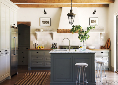
What? No island?!? Yeah. No island. As implied the mention of a galley kitchen, the space-hogging island you see in my BEFORE photos will be removed. For as much as I love such features, unless Maltman's future inhabitants are all Nicole-Richie slim, this 2' wide obstruction is a no-go.

And storage at the end of a counter? What a lovely surprise.
Color scheme. I'm having a hard time deciding between the ease of a so-fresh-and-so-clean white and the drama of a white and charcoal pairing. In my flips, I often went with a medium gray:
But Maltman doesn't get quite enough light to justify a large dose of gray, let alone charcoal. So I think I'm going white. White kitchens to the interior design world are the little black dresses of the fashion world. It's tough to go wrong with one, but it's also tough to avoid ending up with a generic room.


Sick of the usual rectangular subway tile? There's always the option of going square. And gosh, that brass just warms up the otherwise-stark space, doesn't it?


Tiling all the way up the wall (behind the open shelving) makes a huge difference, doesn't it?
The light warm wood used for these open shelves go so well with the white.
And the choice of grout color can also make a big difference.
And the choice of grout color can also make a big difference.

Oil-rubbed bronze hardware is lovely when paired with white.
And a dark-counter is a very practical, yet elegant way to go.

Ooh. A wall of storage! When laying out Maltman's kitchen, I musn't forget a sizable pantry. Open shelves look nice and all - when styled but magazine editors - but us real-people need a place to hide our souvenir mugs and plastic baby utensils. Enter the pantry.
While I probably can't indulge myself and install two walls of charcoal cabinetry, this doesn't mean I'm giving up on a touch of charcoal and possibly brass. The pairing of charcoal and brass equals instant sophistication and richness, no?

Here's a dream kitchen by Jessica Helgerson. That Granada cement tile kills me. In a good way. Since Maltman's kitchen is so narrow, it may be tough to pull off a floor pattern of that scale. Not that I'm not considering it. How gorgeous is this look?

The white farm sink and traditional bridge faucet in chrome against a charcoal backdrop? Handsome!
Meeting with my contractor tomorrow and will be presenting my inspiration boards and layouts. Final boards to come.
No comments:
Post a Comment